Quiz Timer Turning Red at Question 7 Triples Abandonment
A red quiz timer at question seven drives a measurable spike in abandonment that question difficulty alone cannot explain
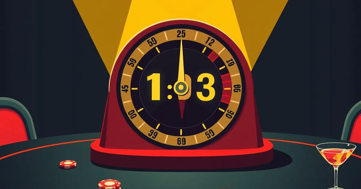
The countdown clock is a design choice, not a neutral fact — and the data from online quiz platforms suggests it's a costly one. When a timer shifts from green to amber to red, users don't just feel a little pressure; a meaningful share of them leave. The question worth sitting with is why a color change at question seven, of all places, produces a spike in abandonment that the raw difficulty of the questions can't fully explain.
The Clock Is a Signal, Not Just a Constraint
Behavioral economists have spent decades documenting how people respond to deadlines and scarcity cues, and the findings are consistent: the perception of dwindling time changes decisions more than the actual amount of time remaining. Daniel Kahneman and Amos Tversky's work on loss aversion established that losses loom larger than equivalent gains — and a timer running down is a loss made visible, ticking in real time. At question seven, the user has already invested effort. That sunk investment raises the psychological cost of quitting, but the red clock simultaneously signals that the remaining investment may not pay off. The two forces collide, and for a substantial minority, the exit wins.
What Red Does That Amber Doesn't
Color carries learned associations that operate below deliberate reasoning. Red is the universal stop signal — traffic lights, error states, warning labels. Interface researchers have found that red UI elements reliably increase arousal and vigilance, which is useful when you want someone to catch a mistake and counterproductive when you want them to keep working calmly. A green-to-amber transition reads as notice; amber-to-red reads as consequence. Platforms that tested a static or hidden timer against a color-shifting one typically find the shifting version produces sharper drop-off at exactly the moment the color flips.
The Variable-Ratio Trap
There's a second dynamic at work, and it's the one worth understanding deeply. Variable-ratio reinforcement — the schedule B.F. Skinner documented in which rewards arrive unpredictably — is the most durable behavior-shaping pattern we know of. Quiz design often borrows from it accidentally: feedback arrives after each answer, sometimes gratifying, sometimes not, and the uncertainty itself sustains engagement. But a red timer interrupts the loop. It converts an open-ended sequence of small uncertain rewards into a bounded, threatened one, and the brain's response to a threatened reward stream is often to disengage rather than push harder. The same mechanism that keeps people answering also makes them sensitive to any signal that the stream is about to close.
Where the Fix Actually Lives
Consider the commonly cited pattern from timed-testing research: when institutions removed visible countdowns and replaced them with milestone markers ("halfway there," "final stretch"), completion rates rose without any change to the actual time allowance. The constraint stayed; the threat display went. That's the useful distinction. Time pressure and time anxiety are different problems, and only one of them requires a red light.
What to Watch Next
The forward-looking move for anyone designing timed experiences is to separate the constraint from its emotional broadcast — test a silent timer, a milestone indicator, or a per-question budget that resets rather than a global countdown that only shrinks. Track abandonment by question index, not just overall completion, because the cliff at question seven is a design artifact you can locate and move. And watch the emerging research on "timer fatigue" in assessment tools: as users encounter more countdowns across more platforms, the red-flip response may sharpen rather than soften. The clock isn't going away. What it says to the person watching it is still entirely a choice.